There’s such a boom of beautiful work being made today that
its overwhelming, and frankly hard to keep up. If you want to rise above the
rest and get your work noticed, you have to dig deeper into the artistry of
creating. By building a strong foundation with art theory basics, you’ll soon
be the one forging the new path, rather than the one lagging a few steps
behind. Let’s get going!
There’s a science to color. Don’t worry. I know you are
artists and science is the last thing on your mind. But understanding, even
minor elements of this concept, is empowering, because art and science are more
closely related than you might think.
As an artist, you have the power to move people. I mean this
both emotionally and literally. With active color combinations, you can create
a mood that makes people feel peaceful, excited, quizzical or even upset. With particular
color placement, you can lead your viewer around your design; you can encourage
them to look, or not look, anywhere you want. That’s huge!
How you use color and combine it, can dramatically increase
the positive interest in your artwork. By keeping just a few basic theories in
mind, when selecting your colors, you’ll take charge of how your audience
interacts with your designs.
Color Basics
Primary colors are
those colors all other colors come from when mixed. Primary colors are red,
yellow and blue. These three colors are the anchor of the color wheel. Connect
them and you create a triangle. All color combinations, including primary colors,
that can be connected by an equilateral triangle on the color wheel, work well
together. A grouping of these colors is a consistently pleasing combination called
triatic harmony.
Secondary colors,
orange, purple and green are made by mixing primary colors. Since they are also
positioned in a triangular fashion, they too make a pleasing combination. Combine
them and you have a fail-safe grouping that is sure to get noticed.
Complimentary
colors are those opposite each other on the color wheel. Complimentary color
couples are: yellow and purple, red and green, orange and blue. These colors,
when used side-by-side cause a mutual vibration that enhances both colors. These
pairs are used together when you want your artwork to really pop.
White attracts the eye more than any color. When used, it
dominates the artwork. It’s used sparingly and intentionally to draw attention
to a specific area, or design element. (White is your super weapon. With it, you control the viewer and dictate where
they look first and what they see, as the primary focal point. Wield it
wisely.)
Black creates a visual hole in artwork. It’s used sparingly and
intentionally for high contrast. (If the project allows, I try to avoid using
black and substitute super dark blue, purple or brown instead. I apply this
idea frequently in projects that have a pictorial theme. When I want to create
deep dark shadows, I use dark blue instead of black. Then my high contrast areas
have warmth, without the negative void.)
For a better understanding of the influence of white and
black on artwork look at a color photograph, and then squint your eyes. By
blurring the details, the high contrast areas become obvious. The white areas come
forward, while the black fields recede to nothingness. Try this when no one’s
looking or they’ll wonder about you.
5 Color Theory Tips
1 Pick a Color Palette and Stick with It
With so many crayons in the box it’s hard to stick to just a
few. But I promise, the desirability of your artwork will greatly improve if
you show restraint. Sticking to your colors indicates conscious thought and
planning. It also suggests that the artwork has deeper meaning, which viewers
find intriguing and therefore worth further study.
2 Work with Primarily Three Colors
Consider one of the three colors, the one you intend to use
most, as the primary color. Use the second color to a lesser degree, so it
complements the primary color without competing with it. The third color is
used the least. Select one that enhances the primary and secondary colors.
When working with a monochromatic (neutral, muted or single
color) color scheme, I like to throw in a zinger. A zinger is an unexpected
complimentary color; it’s used in moderation to serve as an accent. Visually, the
unexpected color gives the quiet field points of interest that lure the viewer
in.
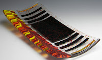
3 Use Multiple Shades of the Same Color
This is especially important when working with glass.
Introducing different hues extends the color palette, bringing fullness and
depth to an otherwise flat material. Asian Poppy is an example of this
approach. For my primary color, red, I used cherry red, red opal and flame. For
the secondary color, amber, I used light amber, medium amber and dark amber. My
accent color was yellow. For the zinger I used olive green stringers. I chose
green because it’s opposite red on the color wheel, and therefore a complementary
color.
4 Repeat Colors
If you use a color in one place repeat that color in at
least two more places. This creates continuity which prompts full exploration
of the entire piece of artwork. It’s not necessary to use the same amount of
color in each application; it’s actually more interesting to vary the color
concentration here and there.
5 How to Find Your Own Fresh Color Palettes
Pay attention to the different color combinations you see daily
and expand on those. I’ve found inspiration to make a fused bowl with a color
palette I found at the mall. I liked the mix of blues on a man’s shirt. Inspired
by a random pile of brightly colored pony-tail bands in my daughter’s bathroom,
I made a really pretty clock. The colors for one of my signature series pieces
was inspired by a picture of a New England beach. In it I combined grey-blue
along with, pale amber, bronze and pale green. Another one was inspired by a
volcano. It was made with shades of red, orange, grey and black. Open yourself
up to new sources beyond the studio and the ideas will come in a flood.
These are guidelines. They’re intended to give you a more
in-depth understanding of the important role color plays in the appearance of
your art. Nothing here is set in stone. There are exceptions to every rule, and
I’m usually first in line to break them. But with this background knowledge, you’ll
make more educated decisions about your construction.
And hopefully, that will take you to the next level.
Until next time, happy fusing,
Lisa
Upcoming Workshops
I’m teaching
two new hands on workshops at D&L
Art Glass Supply in Denver, CO.
June 13 – 16, 2016 where you’ll
learn how to apply these color theories first-hand.
The classes are open to
everyone, not just wholesale customers.
I hope you can join me!
Register here
Check out the video here!
5 Awesome New Things You’ll Learn in
Take
it to the Next Level – Advanced Mixed
Technique 2-Day Workshop, June 13-14, 2016
D&L
Art Glass Supply in Denver, CO.
1 NEW Free-Flow process for artful blends and
washes similar to blown glass.
2 How to create
dramatic effects with color, pattern and texture.
3 How to build
complex, multifaceted works.
4 How to give
your art unique form that stands out from the crowd.
5 How to combine
multiple advanced techniques for engaging artwork.
5 Awesome New Things You’ll Learn in
Breaking
Through – Making Exhibition Quality
Artwork 2-Day Workshop, June 15-16, 2016
D&L
Art Glass Supply in Denver, CO.
1 What it
takes to make break through exhibition quality artwork.
2 How to develop
your own unique design style.
3 How to
create drama with color, texture and pattern.
4 How to
combine advanced techniques for the wow factor.
5 Innovative,
sculptural ways to present and display your art.
Lisa@LisaVogt.net
Web www.LisaVogt.net
YouTube channel https://www.youtube.com/channel/UCKLC1hPWbP6Vzgx2Te9tg-g


